
Beyond the Flyer
A nature-inspired, foldable alternative to the traditional flyer for Dogwood Landscaping & Gardening — turning an ordinary advertisement into something people want to notice, pick up, and explore.
- Tools
- Canva, Printer
- Role
- Creative Direction, Graphic Design & Print Marketing
- Timeline
- 4 hours
- Industry
- Landscaping & Gardening / Home Services
Project Overview
For Dogwood Landscaping & Gardening, I explored a creative alternative to traditional promotional flyers. Rather than relying on conventional rectangular layouts, I wanted to design marketing materials that would naturally capture attention while reflecting the company's identity and services.
The concept evolved into a series of nature-inspired, foldable promotional pieces, beginning with a Dogwood flower and later expanding into autumn leaves to promote seasonal landscaping services.
The objective was simple: Turn an ordinary advertisement into something people would want to notice, pick up, and explore.
Inspiration & Concept
Making the Advertisement Part of the Brand
The initial inspiration came directly from the company's name: Dogwood.
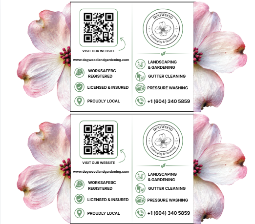
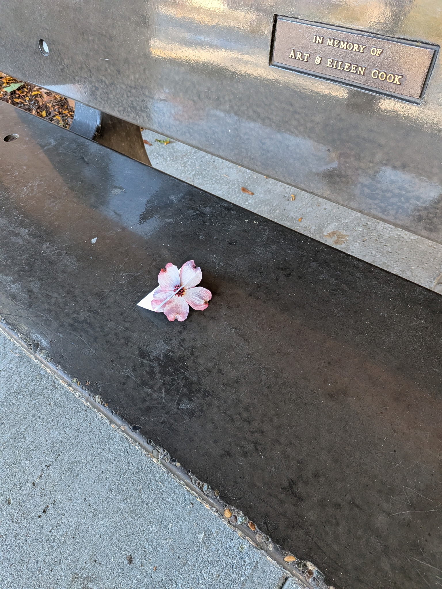
Instead of placing a flower illustration on a standard flyer, I explored the idea of making the promotional material itself resemble a Dogwood flower.
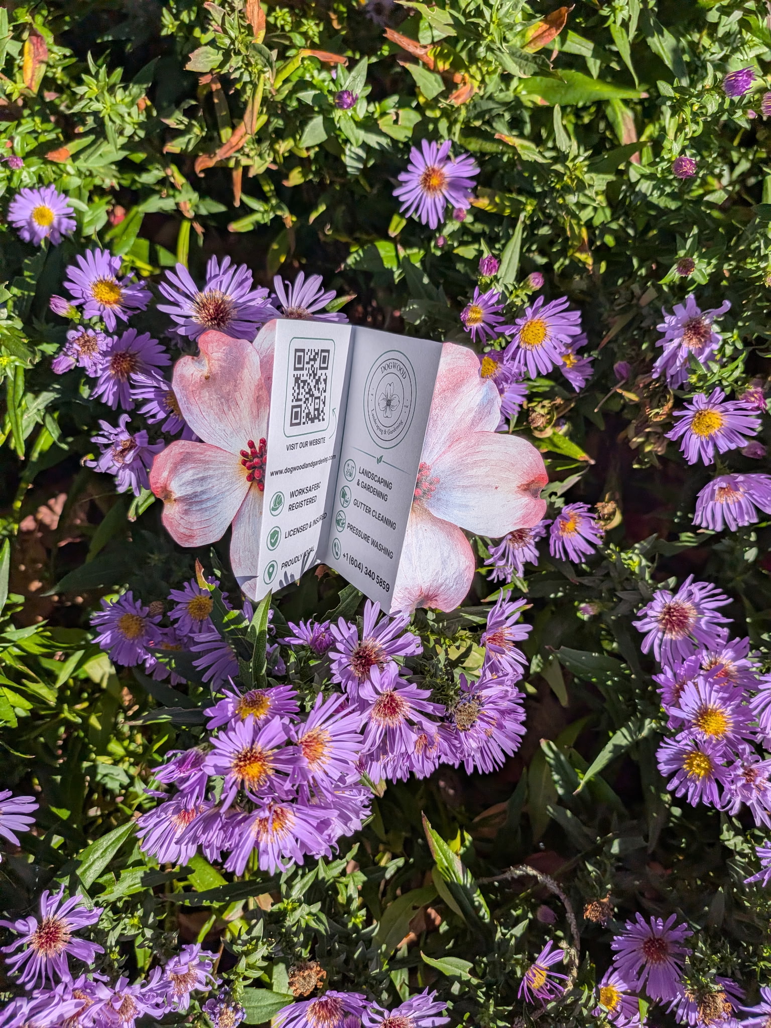
The design combined decorative petals with a central foldable information panel featuring the company logo, services, contact information, and a QR code linking to the website.
This created a balance between visual appeal and practical communication, allowing the design to function as both an eye-catching promotional piece and an accessible source of business information.
Creative Direction
From Brand Identity to Seasonal Storytelling
Concept 01 — Dogwood Flower
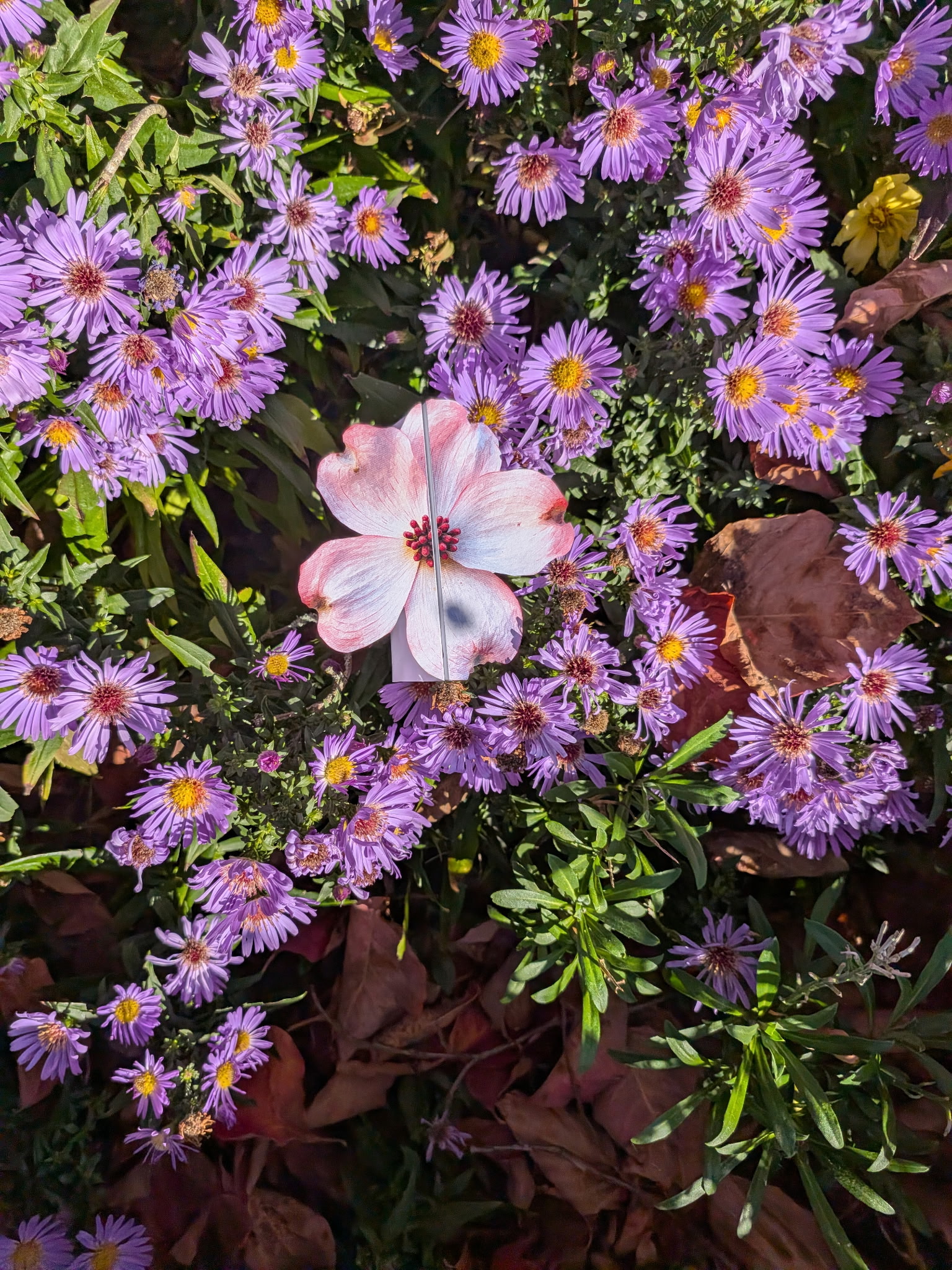
The first design used the Dogwood flower as its visual foundation, connecting the printed advertisement directly to the company's name and nature-focused identity.
The floral silhouette created a distinctive alternative to a traditional flyer.
Concept 02 — Autumn Leaves
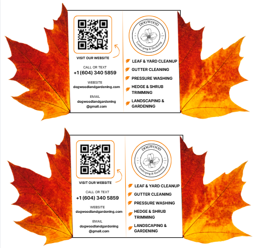
The second design adapted the same approach to promote fall services, including leaf and yard cleanup, gutter cleaning, and pressure washing.
Autumn leaf shapes and seasonal colors made the promotion more relevant to the time of year and the services being advertised.
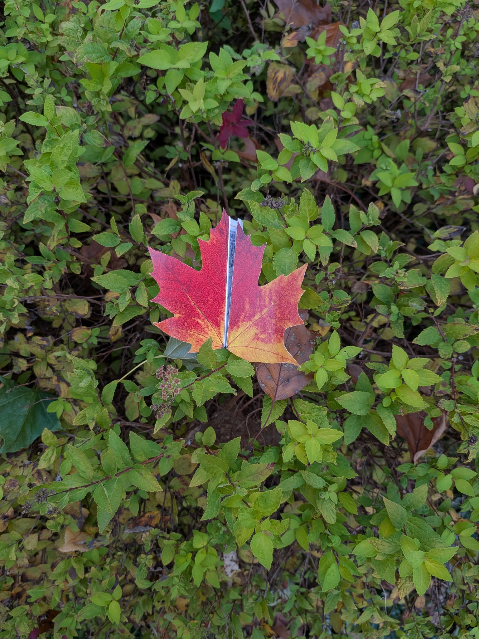
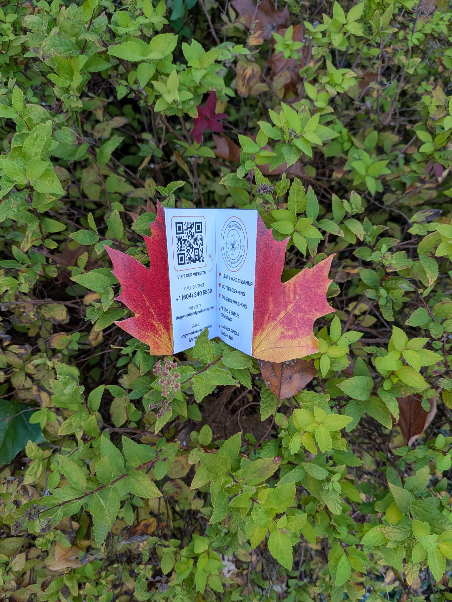
"Both designs followed the same principle: Use a recognizable element of nature to communicate the brand's message before the audience even reads the text."
Design & Brand Integration
Where Creativity Meets Functionality
While the unconventional shapes were intended to attract attention, the printed materials still needed to communicate essential information clearly.
I incorporated the company logo, service descriptions, contact details, and a scannable website QR code into a compact, foldable layout.
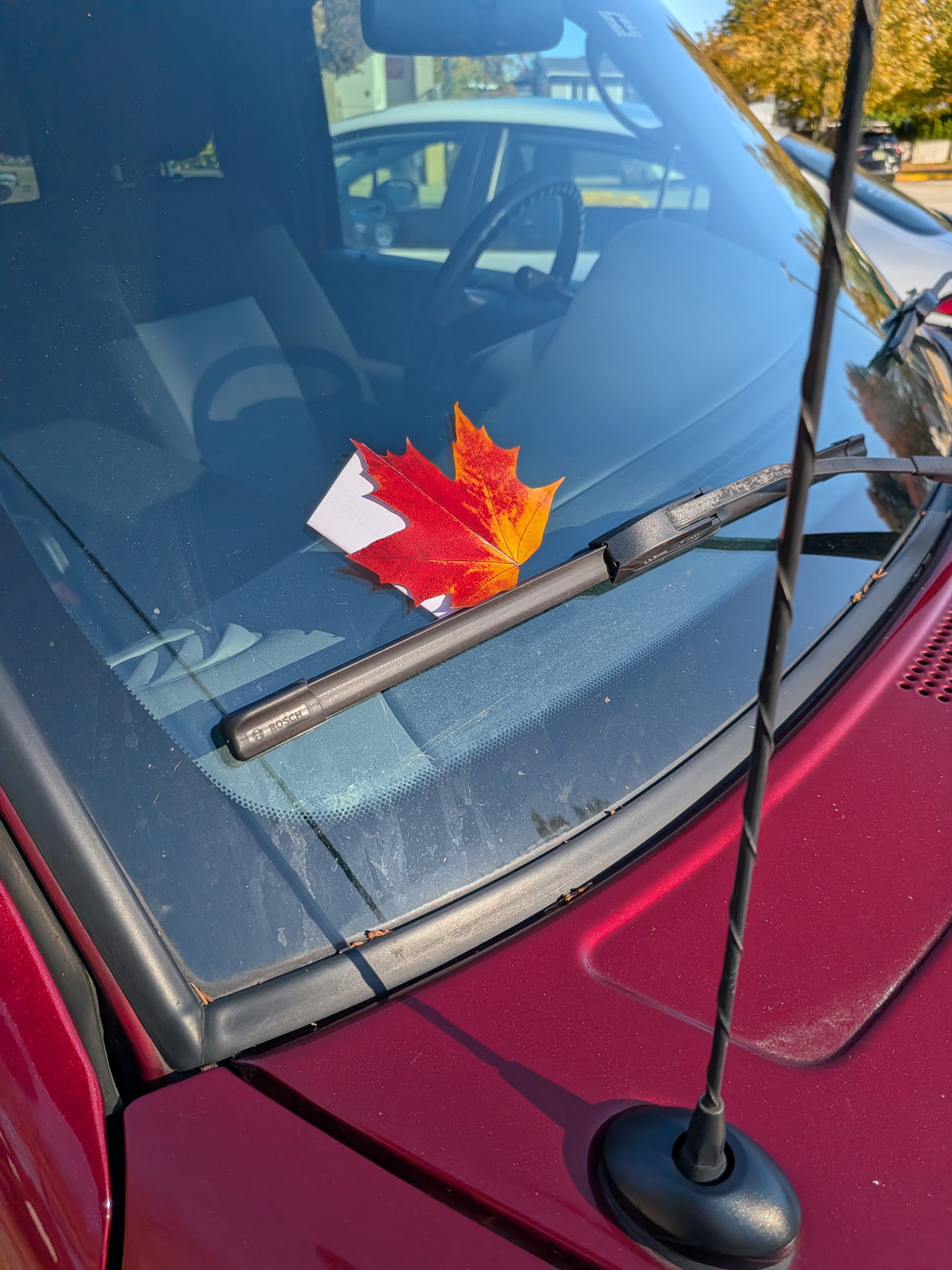
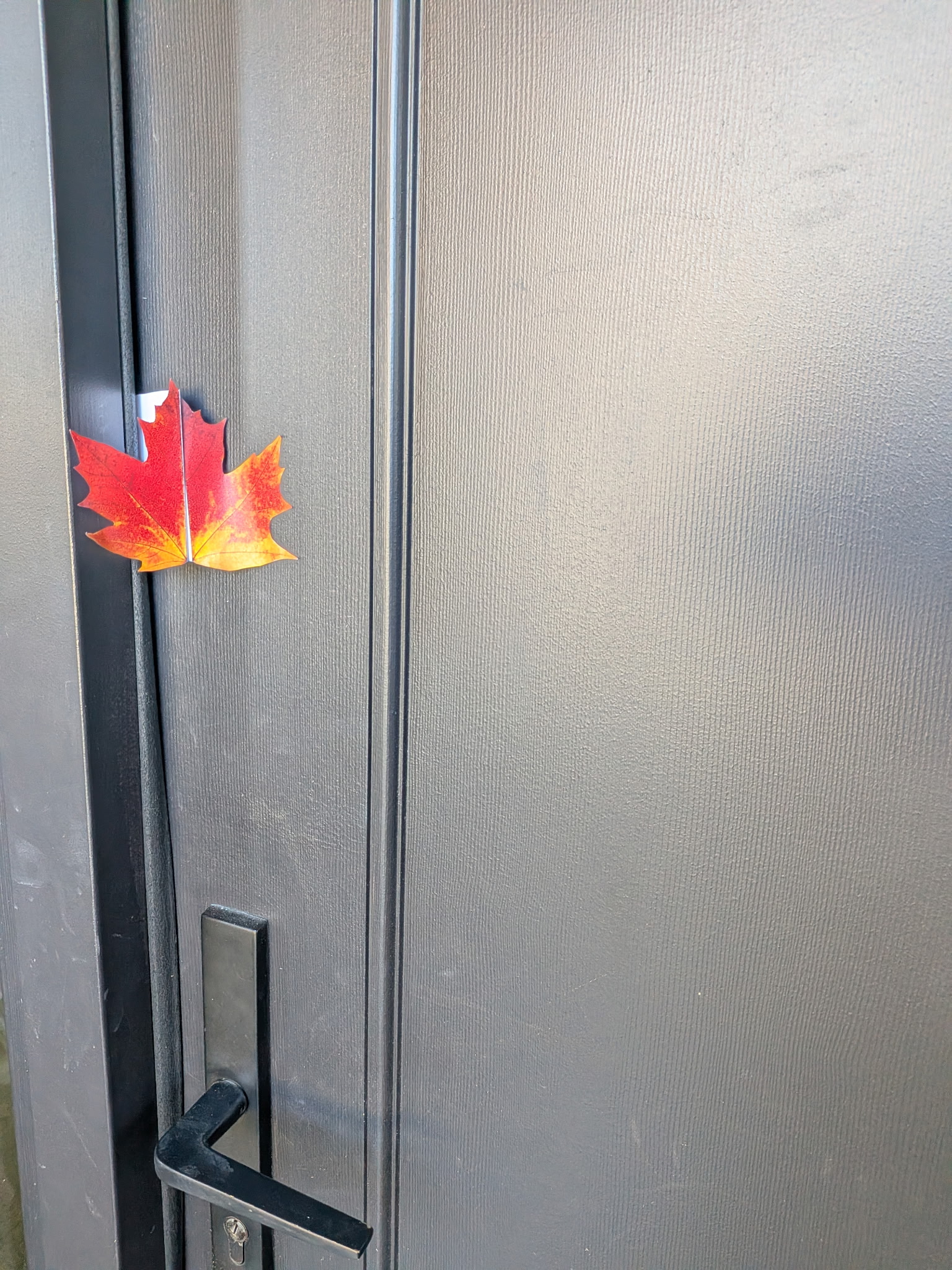
The design also considered how the materials would appear in real-world environments, such as among flowers and foliage or when placed in appropriate locations for distribution.
The combination of physical form, brand identity, and accessible information helped create promotional materials that felt more intentional than a standard advertisement.
Marketing Strategy
Creating Curiosity Through Physical Interaction
Traditional flyers often compete for attention through large headlines, promotional offers, or bold colors. For this project, I explored a different strategy: using an unexpected shape to encourage curiosity.
The flower and leaf designs were intended to stand out in everyday environments, prompting potential customers to look more closely and unfold the material to discover its contents.
The two concepts supported different marketing objectives:
- Dogwood Flower: Establish brand recognition through a visual connection to the company's name.
- Autumn Leaf: Promote timely seasonal services through recognizable fall imagery.
Both approaches aimed to make the advertising feel relevant to the business while encouraging interaction beyond a quick glance.
Outcome
One Concept, Two Marketing Applications
The project resulted in two distinctive print marketing concepts that transformed traditional service advertisements into creative, nature-inspired promotional pieces.
By adapting the design from a Dogwood flower to autumn leaves, I demonstrated how a single creative approach could support both brand awareness and seasonal marketing campaigns.
The project highlights my ability to combine graphic design, brand storytelling, print layout, and marketing strategy to create materials that communicate information while offering a memorable visual experience.
Key Takeaway
"Effective marketing doesn't always require more information or a bigger advertisement. Sometimes, changing how a message is presented can make the entire experience more interesting."
The project produced tangible promotional designs; their impact on customer engagement or inquiries has not yet been measured.
View More Works

UI/UX & Graphic Designer
Zagrosia Engineering INC.
Designed wireframes, interactive prototypes, branding, and marketing materials for modern, user-centered digital experiences.
UI/UX Design • Digital Creative
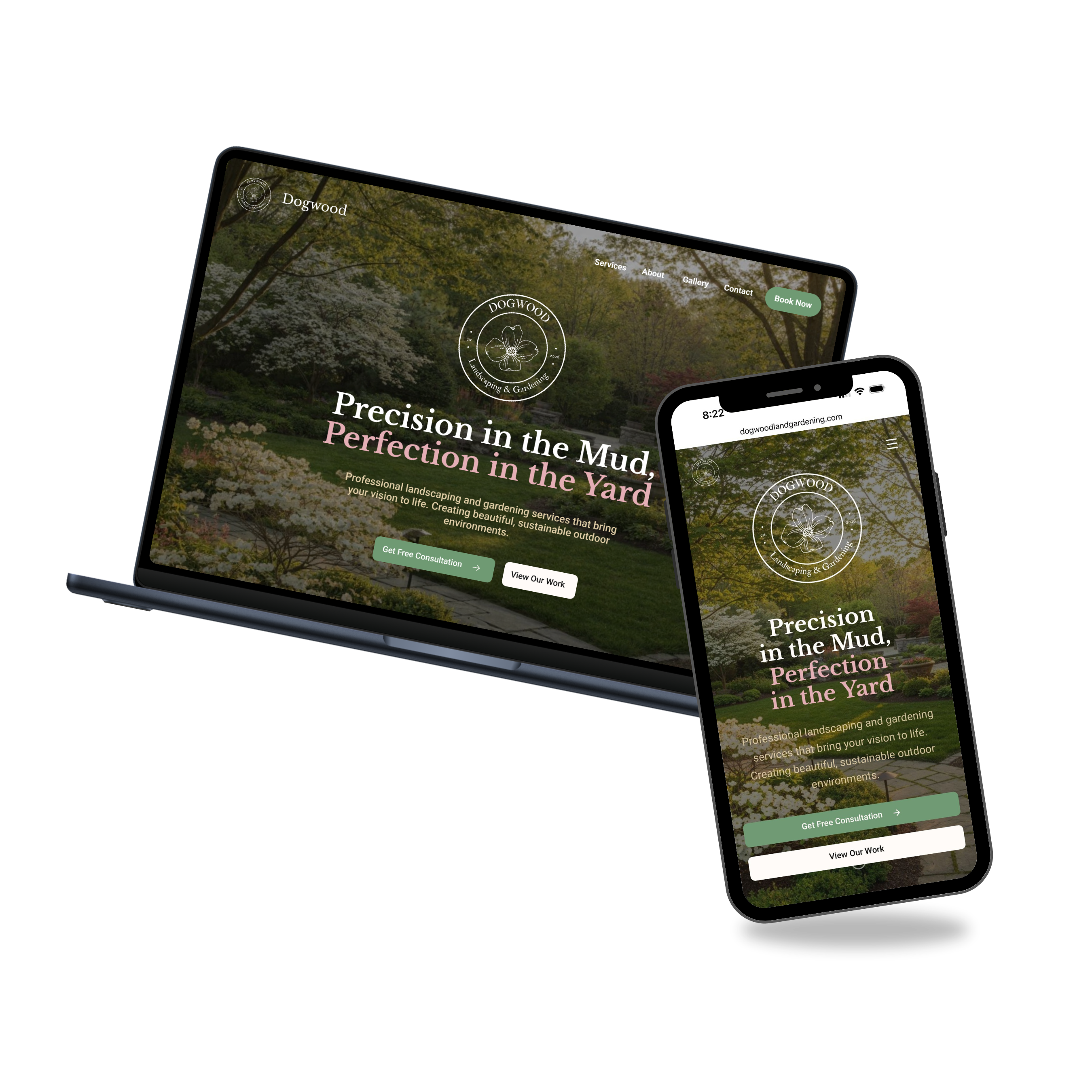
Dogwood Landscaping & Gardening
Freelance project involving wireframes, responsive web design, and front-end development tailored to the brand's identity.
UI/UX Design
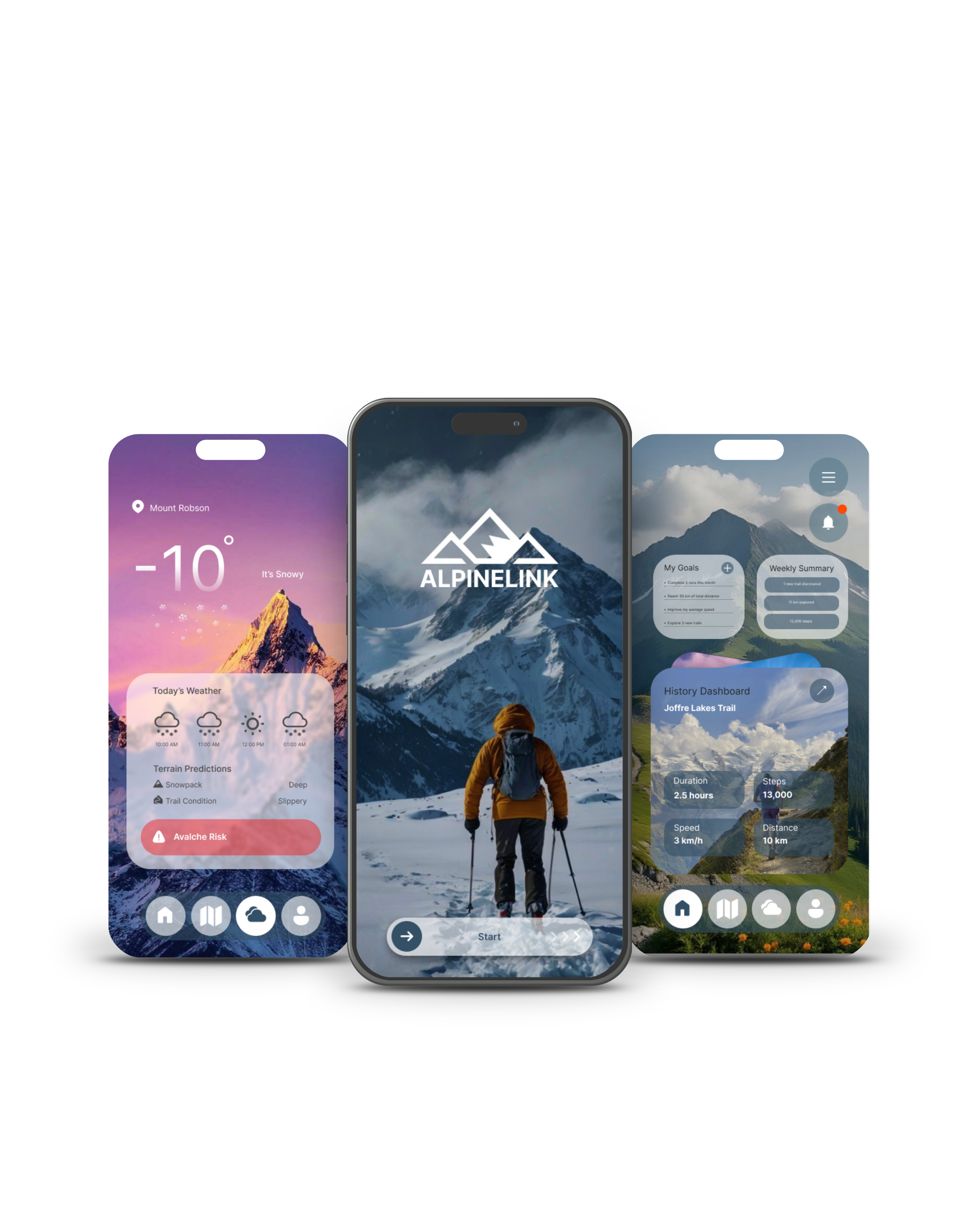
ALPINELINK
An app concept for hikers and outdoor enthusiasts, focused on accessibility, usability, and a more practical, visually appealing experience.
UI/UX Design
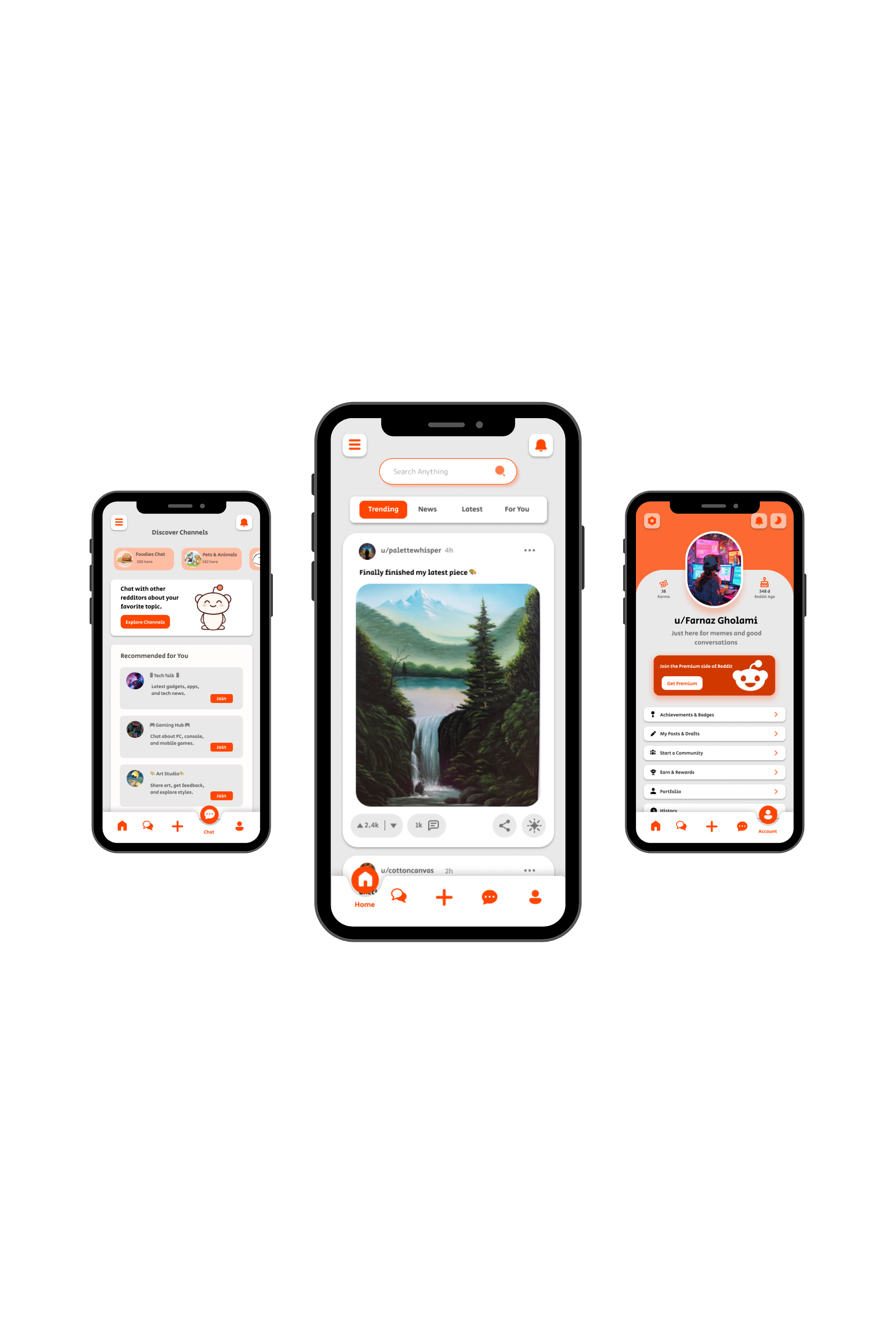
Reddit Redesign
BCIT UI/UX project focused on redesigning Reddit with a cleaner, more modern, and user-friendly experience.
UI/UX Design
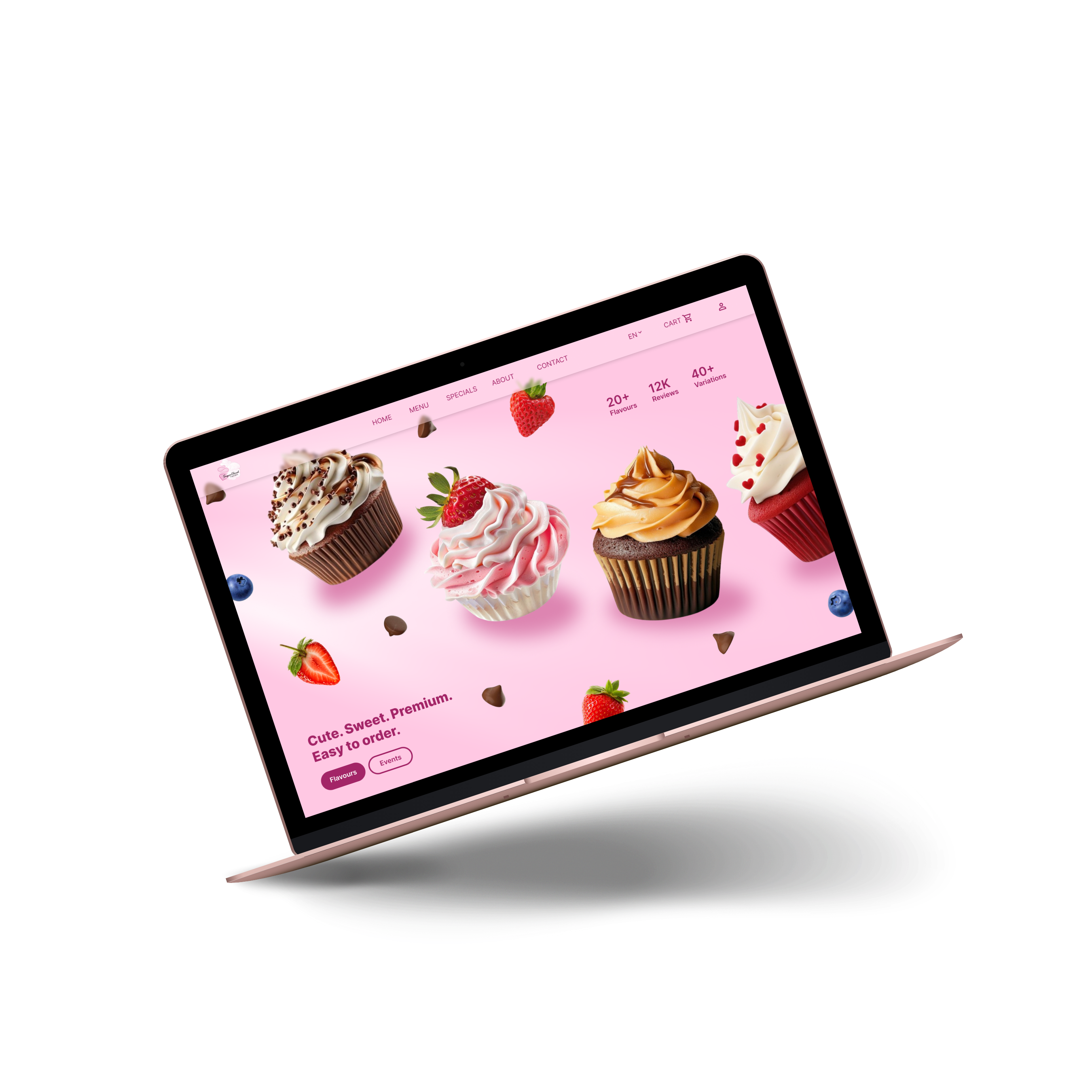
SugarCloud Cupcake
Individual UI/UX project focused on creating a fully interactive Figma prototype using advanced prototyping techniques.
Social Media & Motion Design
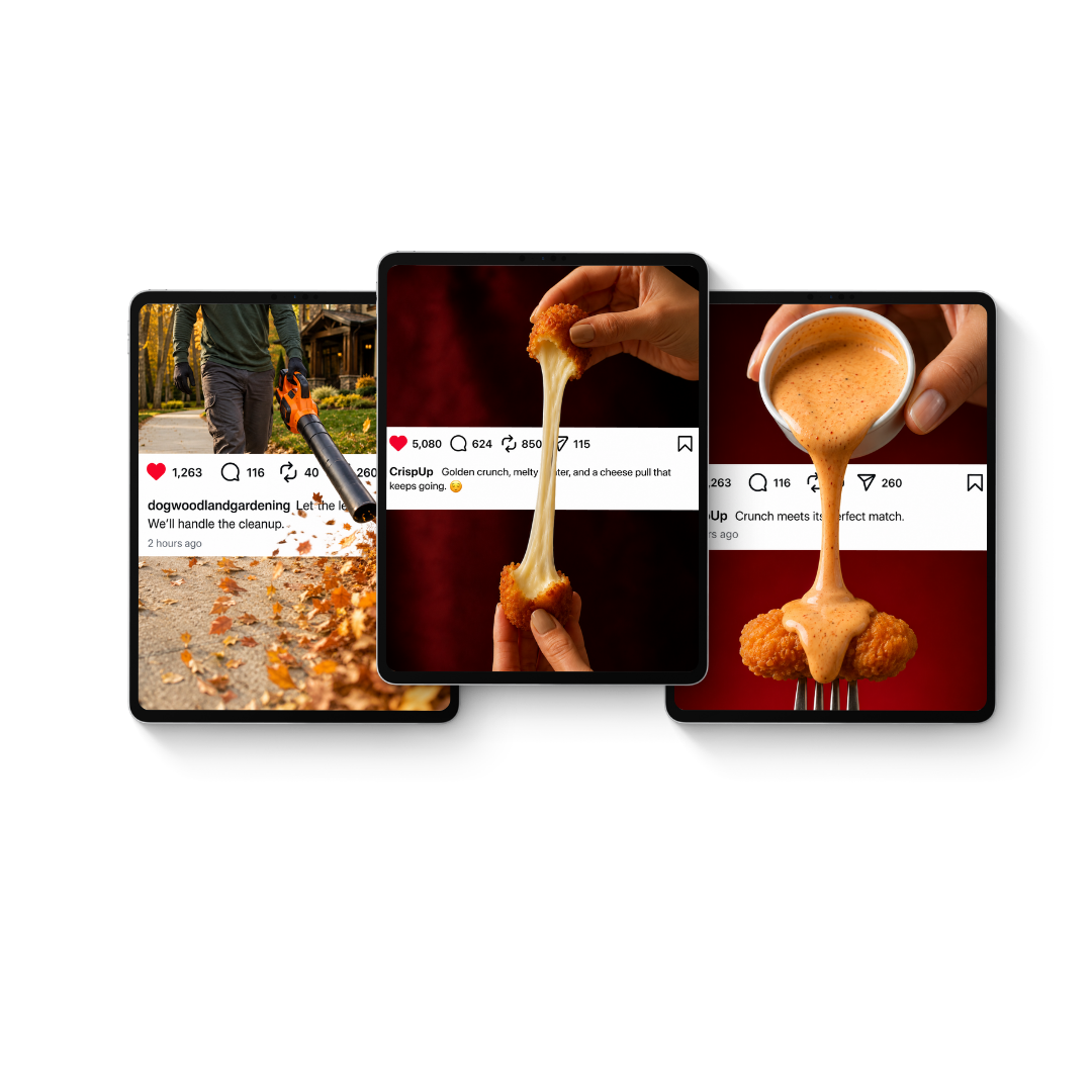
Breaking the Feed
An exploration of AI-assisted motion marketing — where one intentional movement, connected to the brand's message, transforms a static post into a scroll-stopping experience.
Brand Marketing & Social Media
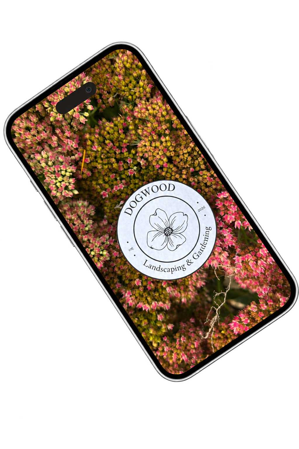
One Logo, Many Places
A brand awareness reel for Dogwood Landscaping & Gardening — one logo, sixty environments, one recognizable identity.