
Redesign
BCIT UI/UX project focused on redesigning Reddit with a cleaner, more modern, and user-friendly experience.
- Tools
- Figma, Illustrator, Photoshop
- Role
- UI/UX Designer
- Timeline
- 3 Weeks
- Industry
- Social / Mobile App
Project Overview
Reddit is one of the world's largest online discussion platforms, bringing together millions of users across thousands of communities to share knowledge, ask questions, and participate in conversations. Its community-driven content is one of its greatest strengths, but the mobile experience can sometimes make that content difficult to discover and navigate.
This redesign reimagines the Reddit mobile app with a stronger focus on usability, visual clarity, and personalization. Rather than changing Reddit's core functionality, the project aims to refine the user experience by reducing interface complexity, improving content discovery, and creating a more engaging profile experience while preserving the platform's community-first identity.
Project Goals
- Clarity — Improve readability through stronger visual hierarchy, cleaner layouts, and reduced interface clutter.
- Discovery — Help users find relevant communities, discussions, and answers more efficiently.
- Personalization — Create richer user profiles that encourage self-expression and strengthen community identity.
Challenge
To better understand the existing experience, I conducted a UX audit of Reddit's mobile application, focusing on how users browse content, discover communities, create posts, and interact with others. While Reddit excels at fostering community-driven discussions, several usability issues reduce the overall experience and make everyday tasks less efficient.
Cluttered Content Layout
Posts, advertisements, and promoted content often share similar visual treatments, making it difficult for users to quickly distinguish between different types of content. This increases cognitive load and slows content discovery.
Limited Profile Experience
User profiles provide limited opportunities for personalization, making it difficult for users to showcase their interests, achievements, and community identity.
Inefficient Content Discovery
Finding relevant discussions frequently depends on manual searching rather than intuitive exploration, making it harder for users to discover communities aligned with their interests.
Unclear Content Creation
The posting interface provides limited guidance when creating different types of posts, increasing friction for both new and returning users.
Underutilized Chat Experience
The messaging interface functions primarily as a conversation tool but lacks personalization and opportunities to discover related communities or continue meaningful engagement.
"How might we redesign Reddit's mobile experience to reduce interface complexity, improve content discovery, and encourage stronger user identity without compromising the familiarity and authenticity that make Reddit unique?"
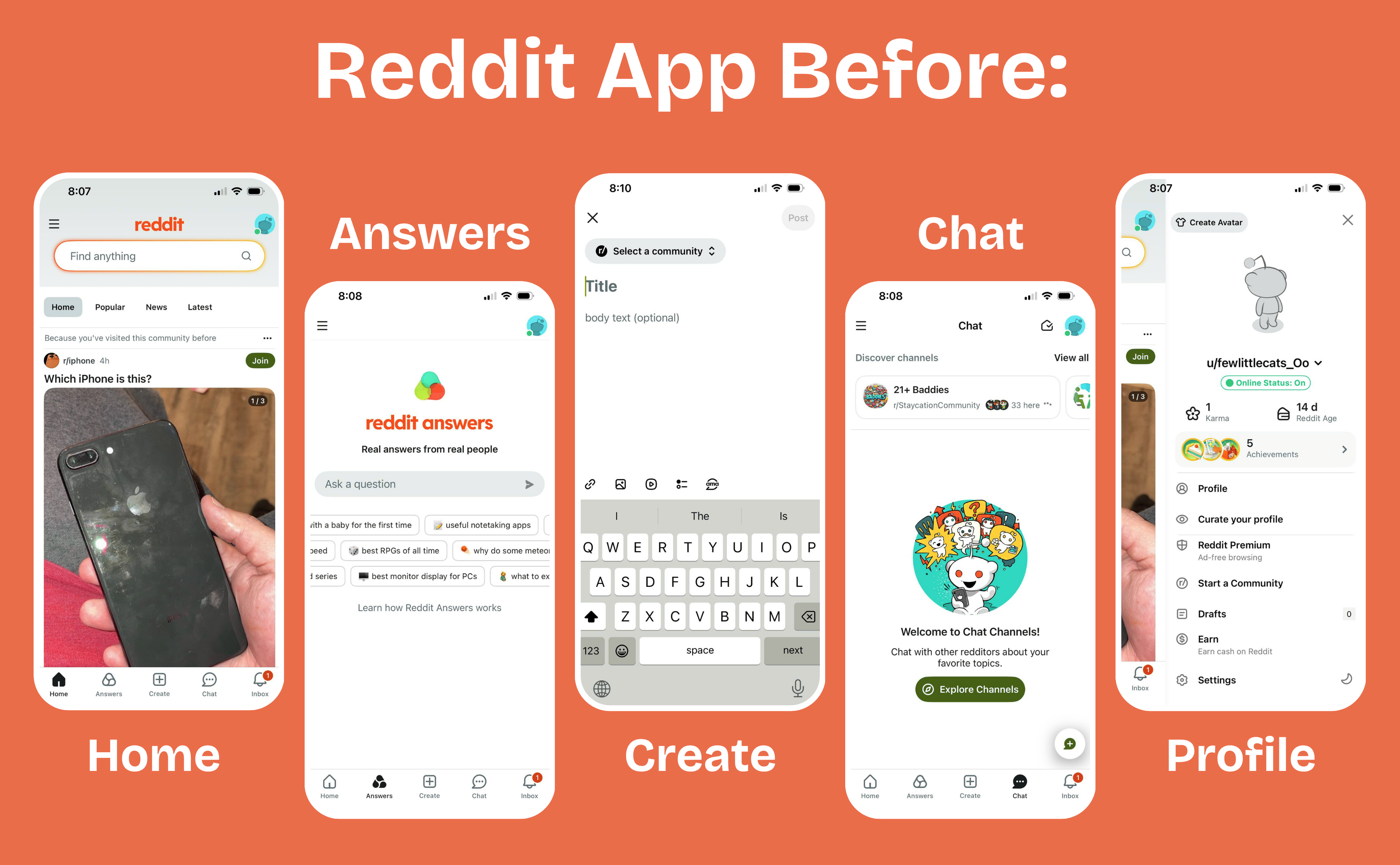
Research
Before redesigning the interface, I explored how users interact with Reddit to better understand their goals, behaviors, and frustrations. The research combined a UX audit with user-centered methods, including a User Persona, User Scenario, Empathy Map, and Journey Map, to identify opportunities for improving navigation, content discovery, and personalization.
Together, these research activities revealed that while Reddit offers an enormous amount of valuable content, the overall experience often feels overwhelming due to visual clutter, inconsistent hierarchy, and limited opportunities for users to express their identity.
Research Insights
The research uncovered four key opportunities that guided the redesign:
Improve Content Clarity
Users want to scan posts quickly without feeling overwhelmed. A clearer visual hierarchy and better separation between posts, advertisements, and links can reduce cognitive load and make browsing more efficient.
Simplify Content Discovery
Users frequently visit Reddit to find answers, follow trending discussions, and discover new communities. Relying primarily on search slows exploration, creating an opportunity to introduce more intuitive discovery features.
Strengthen User Identity
Profiles should represent more than basic account information. Users want richer profiles that showcase their interests, achievements, and community involvement, creating a stronger sense of belonging.
Encourage Community Engagement
Beyond reading posts, users expect meaningful ways to participate. Providing clearer content creation, personalized recommendations, and community-focused features encourages ongoing engagement throughout the platform.
User Persona
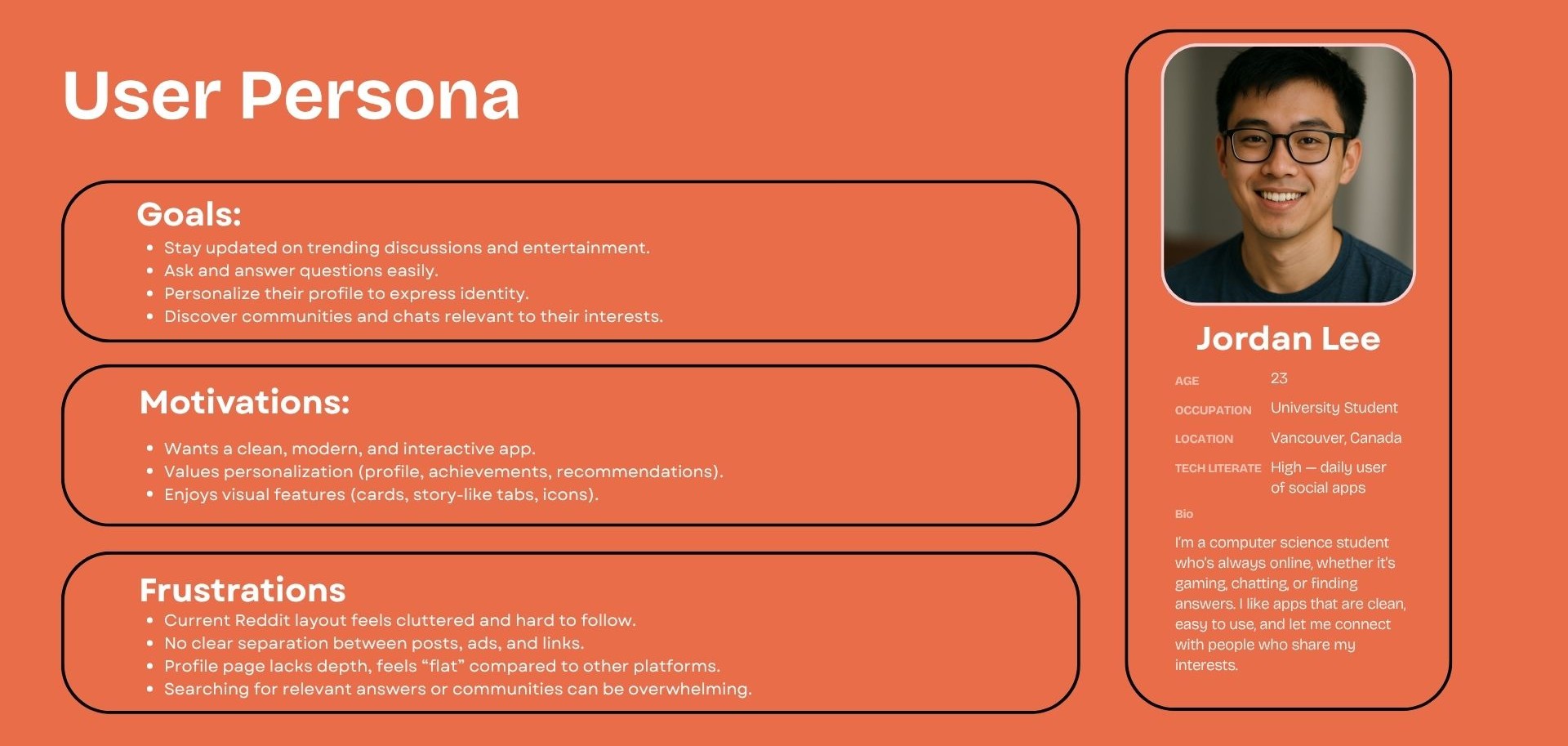
To represent Reddit's primary audience, I developed Jordan Lee, a 23-year-old university student who uses Reddit daily to stay informed about gaming, technology, and online communities. Jordan values speed, personalization, and intuitive navigation but becomes frustrated when cluttered layouts make information difficult to find.
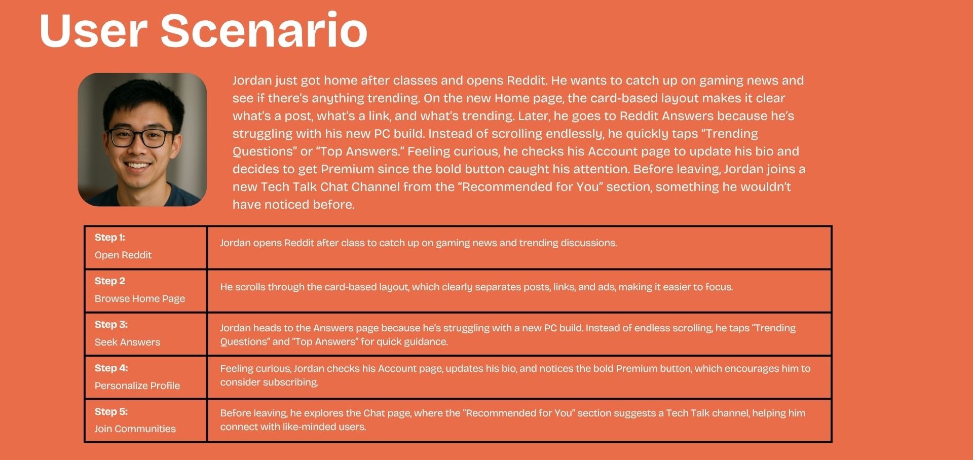
User Scenario
Empathy Map
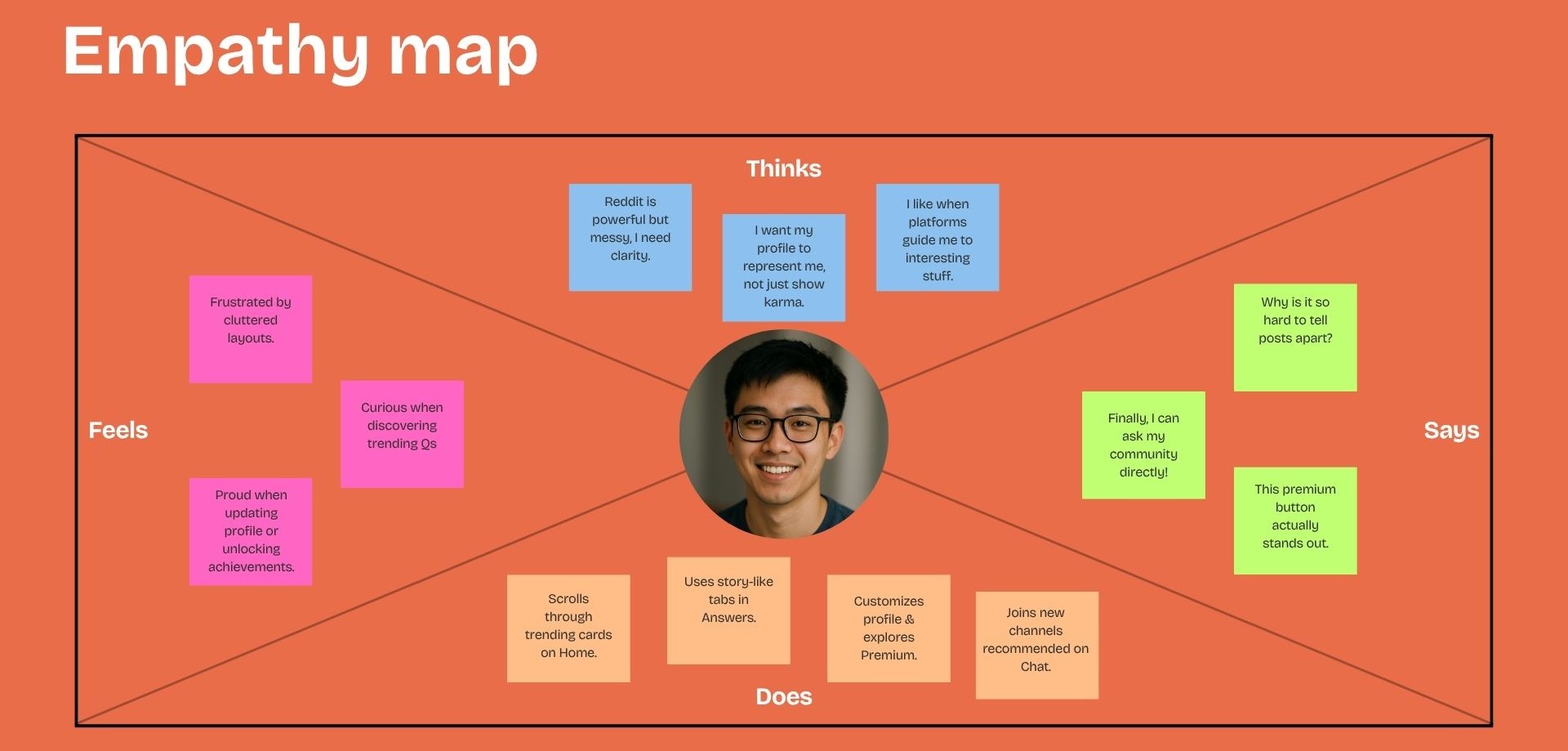
The empathy mapping exercise provided a deeper understanding of Jordan's motivations and emotional responses.
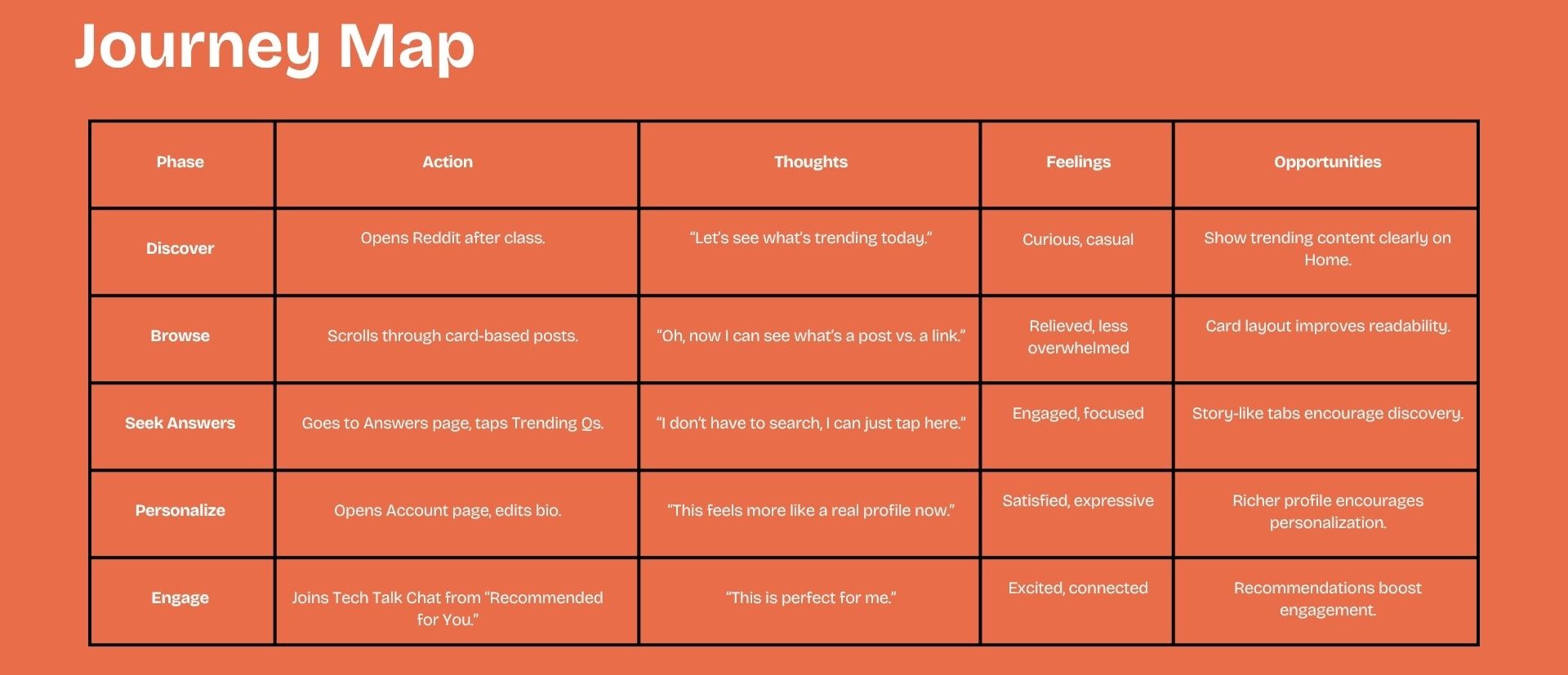
Journey Map
The journey map highlighted opportunities at every stage: improving visibility of trending content on the Home feed, reducing clutter through a card-based layout, introducing guided discovery with Trending Questions and Top Answers, creating richer user profiles, and recommending communities based on user interests.
Design Process
The redesign maintains Reddit's recognizable identity while modernizing its visual experience.
Colour Palette
The interface continues to use Reddit's signature orange color, helping maintain brand recognition while adding warmer tones and improved visual hierarchy.
Visual Style
The design introduces playful illustrations, rounded cards, consistent icons, and warm color accents — elements that align with Reddit's friendly and community-driven personality.
Design Direction
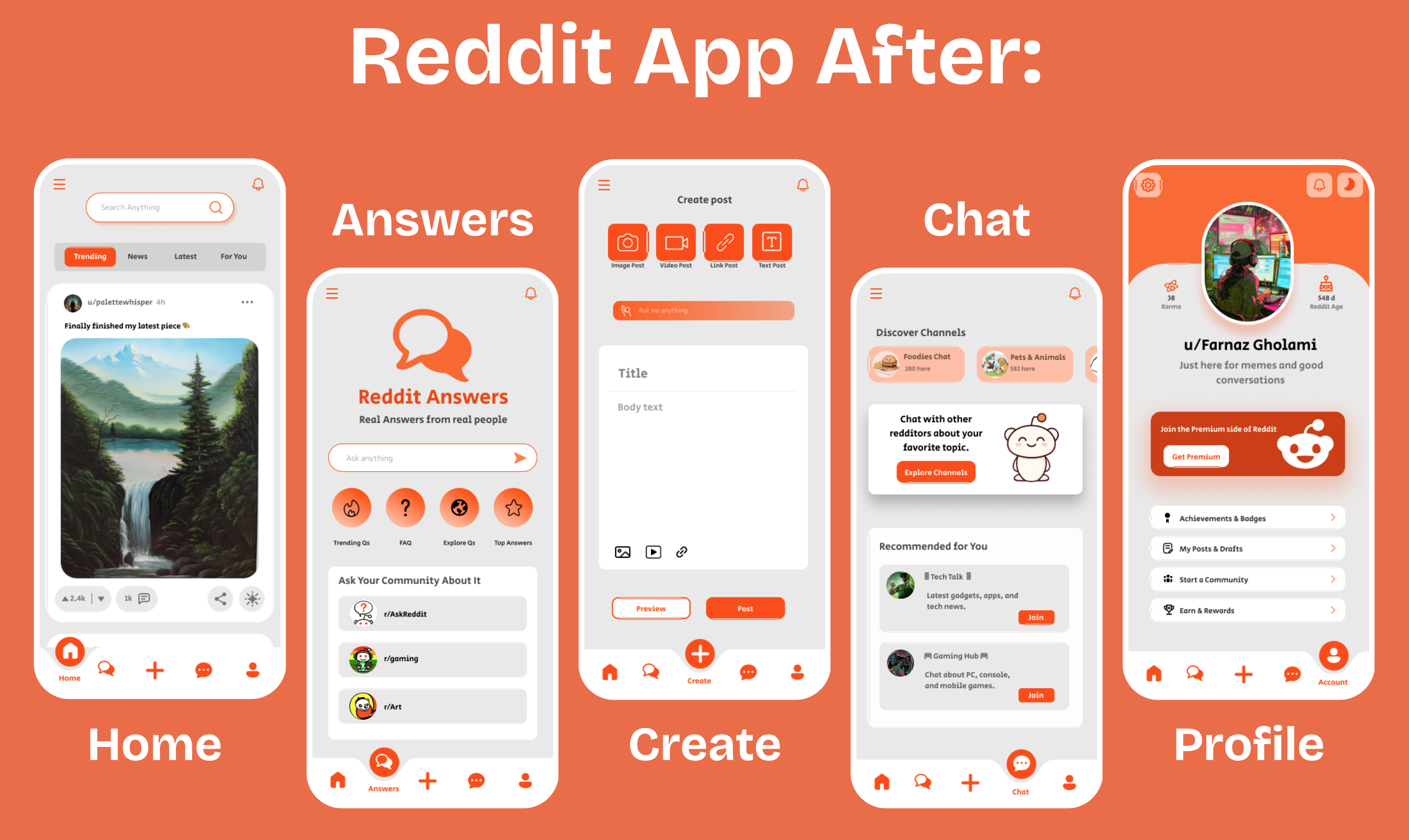
The visual approach focuses on creating a platform that feels approachable, modern, interactive, and community-oriented. Identified five high-impact screens to redesign: the home feed, answers, create-post flow, chat, and user profiles. Each was explored in multiple directions before committing to a high-fidelity solution.
Focused on consistent card sizing, clearer community identity at the post level, guided content creation, and expanded profile and chat experiences.
Solution
The redesign focused on creating a cleaner, more intuitive Reddit experience by improving the platform's most frequently used screens. Each redesign addressed a specific usability challenge identified during the UX audit while preserving Reddit's familiar community-driven experience.
Home Feed
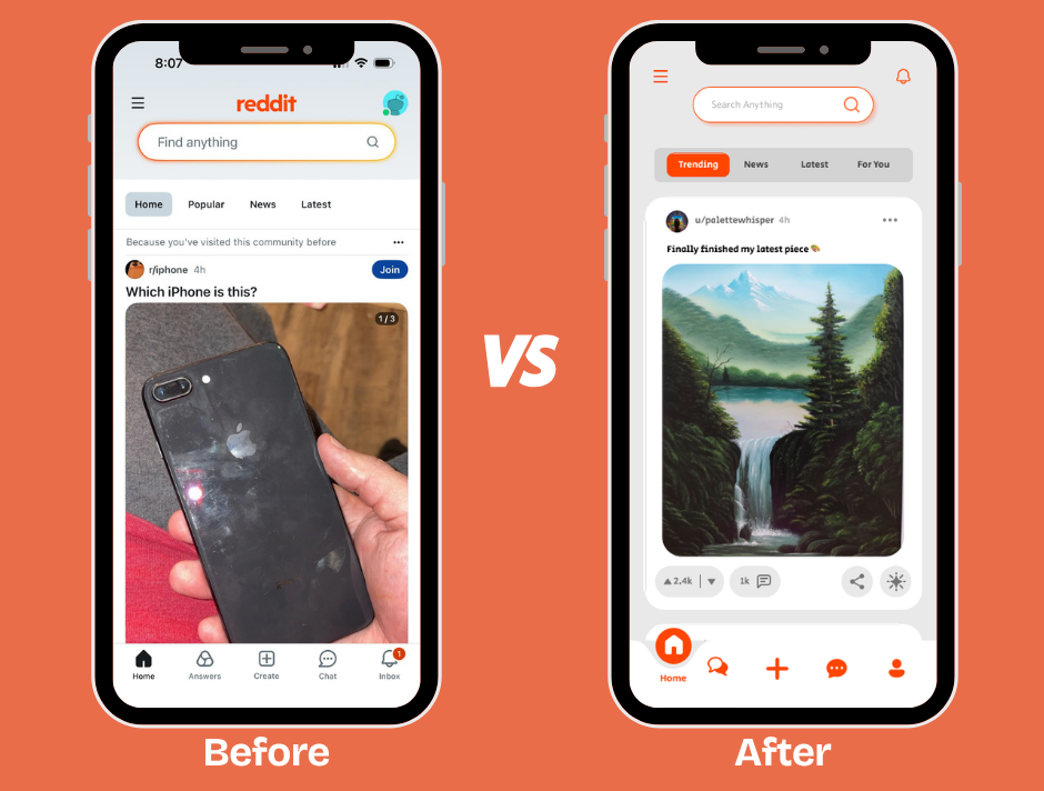
The Home Feed was redesigned to improve readability and reduce visual clutter. A card-based layout, stronger visual hierarchy, and increased spacing make it easier to distinguish posts, advertisements, and community content at a glance.
- Card-based post layout for improved readability.
- Clear separation between organic and promoted content.
- Improved visual hierarchy and spacing.
- Simplified navigation with a more balanced footer.
Answers
The Answers experience was redesigned to encourage exploration rather than relying solely on search. New discovery sections help users quickly find relevant discussions, frequently asked questions, and trending conversations.
- Trending Questions
- Frequently Asked Questions
- Explore Topics
- Top Answers
- Community-driven content recommendations
Create Post
The content creation flow was redesigned to make posting more intuitive and approachable. Clear post-type options reduce decision-making, while guided prompts encourage users to participate with confidence.
- Quick post-type selection for Image, Video, Link, and Text.
- "Ask Me Anything" prompt featuring trending topics and hashtags.
- Preview option before publishing.
- Cleaner, more structured composition flow.
Chat
The Chat experience was expanded beyond messaging by introducing community discovery and personalized recommendations.
- Discover Channels section.
- Recommended Communities based on user interests.
- Improved visual hierarchy and engaging illustrations.
Profile
The profile experience was redesigned to strengthen user identity and encourage long-term engagement.
- Personalized bio section.
- Prominent Karma and Reddit Age statistics.
- Achievements and badges.
- Community creation tools.
- Reddit Premium call-to-action.
"Together, these improvements transform Reddit into a cleaner, more discoverable, and more personalized mobile experience."
Final Design
The final redesign transforms Reddit into a cleaner, more intuitive, and engaging mobile experience while preserving the platform's community-first identity. Rather than reinventing the product, the redesign enhances the way users discover content, participate in discussions, and express themselves through thoughtful UX improvements and a more modern visual language.
The redesigned interface introduces stronger visual hierarchy, card-based content organization, and guided discovery features that make browsing feel more focused and less overwhelming. Richer user profiles, personalized recommendations, and a more engaging chat experience strengthen users' sense of identity while encouraging deeper participation within Reddit's communities.
Key Features
- Improved Readability — Card-based layouts and clearer visual hierarchy make posts easier to scan and distinguish from advertisements.
- Enhanced Content Discovery — Trending Questions, Top Answers, and curated discovery sections help users explore communities without relying solely on search.
- Richer User Profiles — Personalized bios, achievements, and community features create a stronger sense of identity and ownership.
- More Engaging Community Experience — Personalized chat recommendations and community suggestions encourage ongoing interaction beyond the home feed.
- Modern Visual Language — Refined spacing, consistent components, and Reddit's signature color palette create a cleaner and more approachable interface.
The result is a redesign that improves usability without compromising the familiarity that existing Reddit users expect, creating a more accessible, engaging, and user-centered mobile experience.
Reflection
Redesigning Reddit challenged me to balance innovation with familiarity. Instead of introducing unnecessary changes, I focused on understanding the platform's core strengths and identifying opportunities to improve usability while respecting the behaviors of existing users.
This project strengthened my ability to evaluate complex digital products, translate research into meaningful design decisions, and create interfaces that balance functionality with visual clarity. It also reinforced the importance of designing complete user journeys rather than isolated screens, ensuring every improvement contributes to a more cohesive and engaging experience.
Most importantly, this redesign reminded me that successful UX isn't about changing everything — it's about recognizing what already works, solving genuine user problems, and creating experiences that feel both intuitive and familiar.
View More Works
UI/UX & Graphic Designer
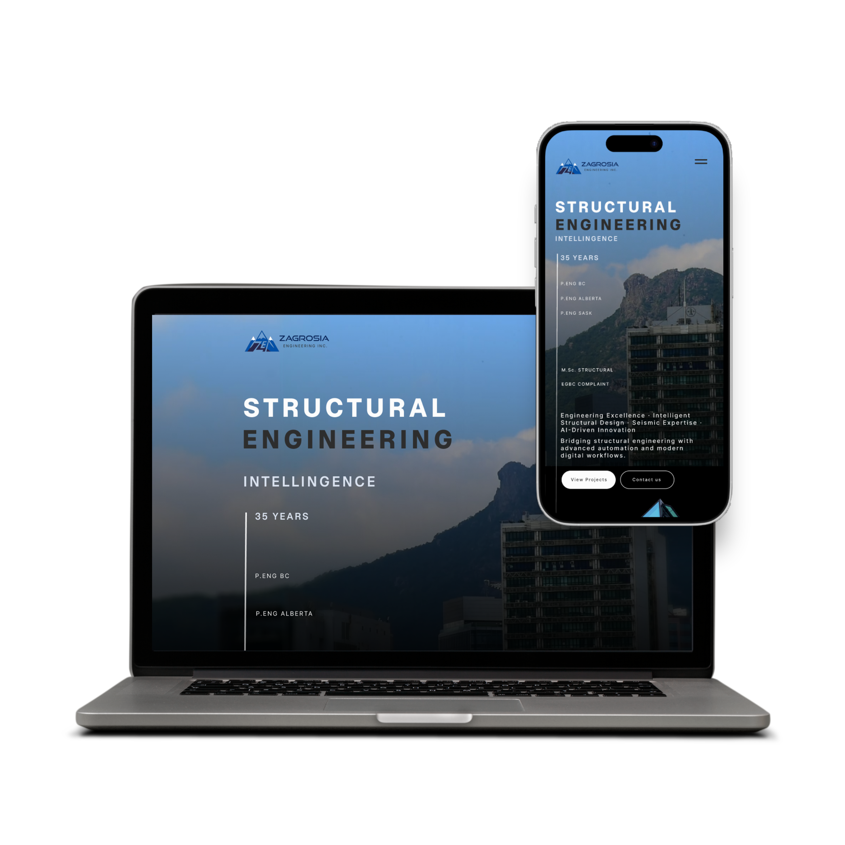
Zagrosia Engineering INC.
Designed wireframes, interactive prototypes, branding, and marketing materials for modern, user-centered digital experiences.
UI/UX Design • Digital Creative
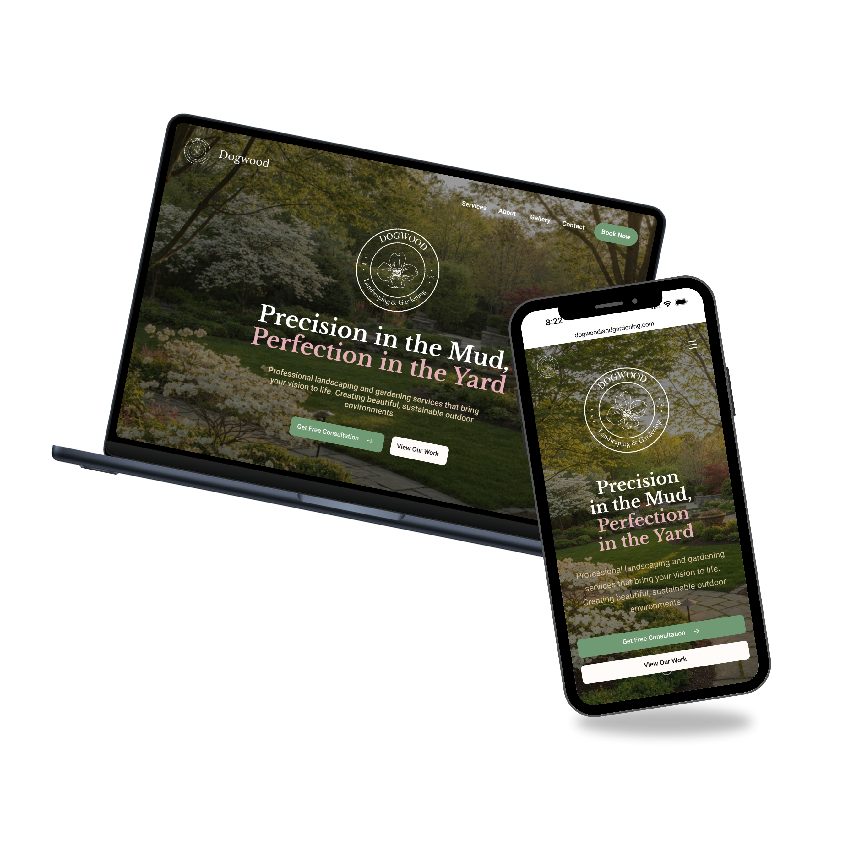
Dogwood Landscaping & Gardening
Freelance project involving wireframes, responsive web design, and front-end development tailored to the brand's identity.
UI/UX Design
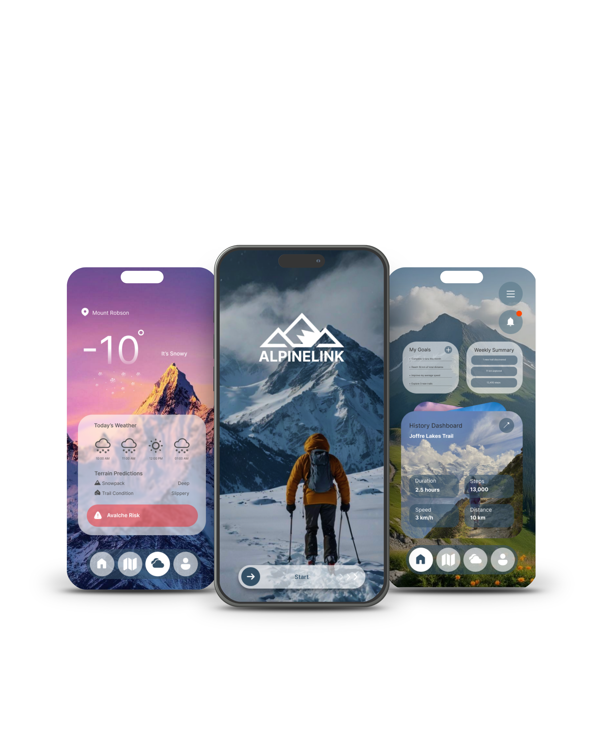
ALPINELINK
An app concept for hikers and outdoor enthusiasts, focused on accessibility, usability, and a more practical, visually appealing experience.

UI/UX Design
SugarCloud Cupcake
Individual UI/UX project focused on creating a fully interactive Figma prototype using advanced prototyping techniques.
Social Media & Motion Design
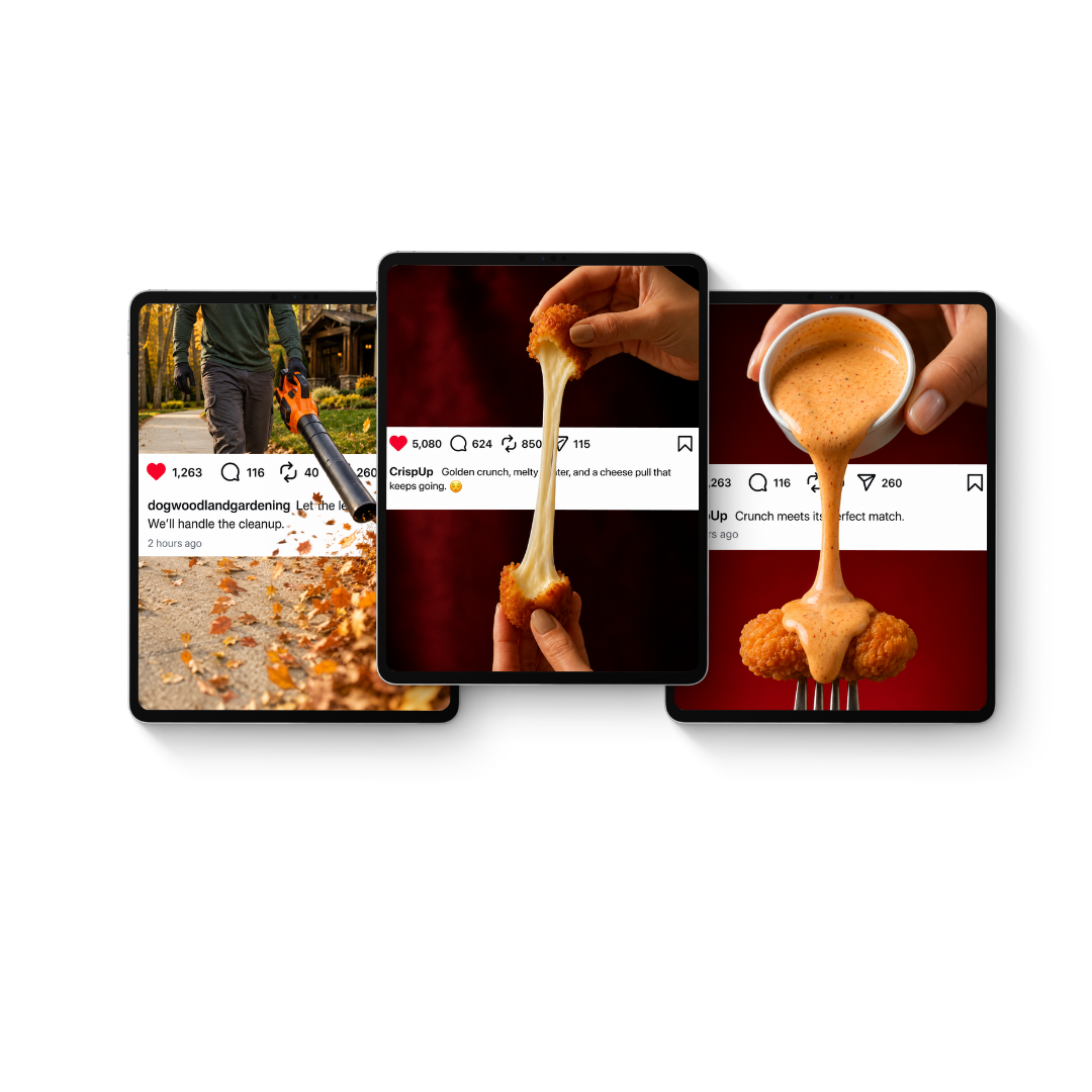
Breaking the Feed
An exploration of AI-assisted motion marketing — where one intentional movement, connected to the brand's message, transforms a static post into a scroll-stopping experience.
Brand Marketing & Social Media
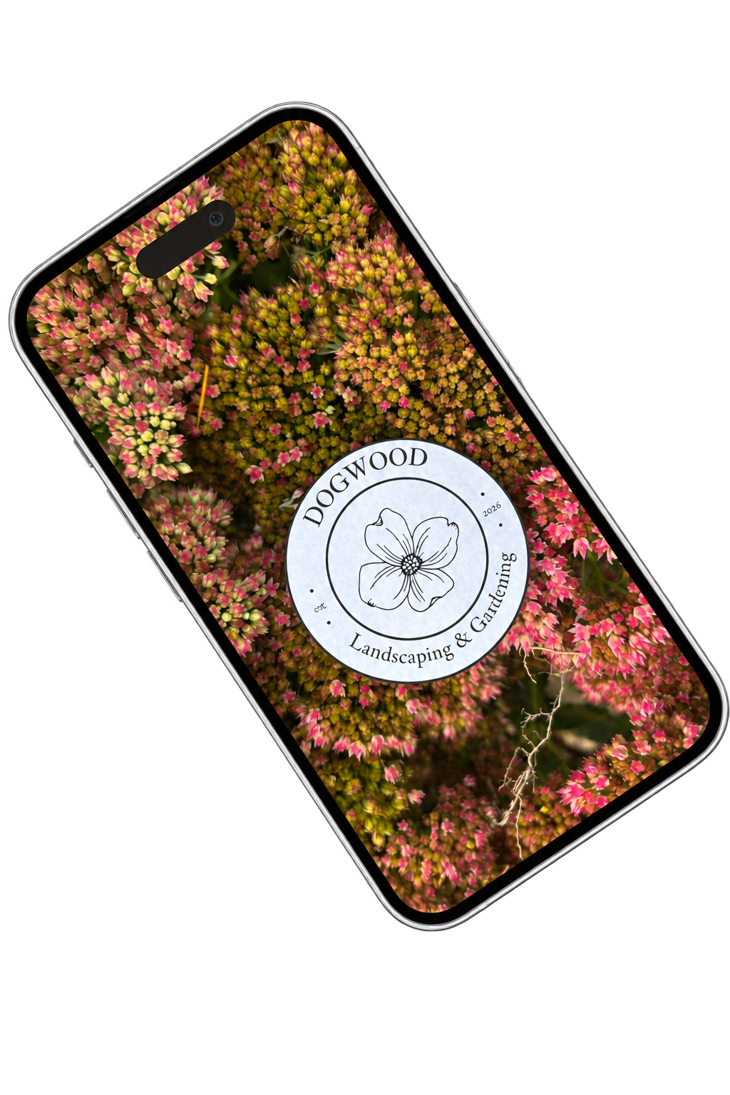
One Logo, Many Places
A brand awareness reel for Dogwood Landscaping & Gardening — one logo, sixty environments, one recognizable identity.