
Dogwood
Landscaping & Gardening
Freelance project involving wireframes, responsive web design, and front-end development tailored to the brand's identity.
- Tools
- Figma, Illustrator, Photoshop, Canva, React, VSC
- Role
- UI/UX Designer, Branding, Developer
- Timeline
- 4 Weeks
- Industry
- Landscaping & Gardening
Project Overview
Dogwood Landscaping is a locally owned Canadian landscaping and property maintenance company offering services such as landscaping, gardening, pressure washing, gutter cleaning, and seasonal outdoor maintenance.
The client's goal was to establish a professional online presence that clearly communicates their services while making it easy for potential customers to request quotes and contact the business. Because the company's target audience ranges from young homeowners to seniors, usability and accessibility were key priorities.
As the UI/UX designer, my objective was to create a clean, intuitive, and user-friendly website with straightforward navigation, ensuring visitors of all ages could easily find information, explore services, and take action with confidence.
Challenge
Dogwood Landscaping serves a broad audience, including homeowners with varying levels of digital experience. Many visitors arrive with a single goal: to quickly determine whether the company offers the service they need and how to get in touch.
The challenge was to design an experience that minimizes effort and guides users naturally through the website. Visitors should be able to understand the company's services simply by scrolling, with each section featuring a clear call-to-action that encourages them to request a quote or make contact.
To support usability for all age groups, essential information — including the company's primary services, value proposition, and contact options — was placed prominently within the hero section and reinforced throughout the homepage. The navigation was intentionally kept simple, predictable, and easy to understand, ensuring users could find what they needed without confusion.
"How might we help users find the right service with minimal effort?"
Research
Brand Research
The project began with developing a brand identity that reflects both the company's services and its local roots. The objective was to create a visual identity that feels authentic to British Columbia while communicating professionalism, trust, and a strong connection to nature.
Finding the Right Symbol
As part of the research process, I explored plants and natural elements native to British Columbia to identify a meaningful symbol for the brand. This led to the Dogwood flower, the province's official floral emblem. Its clean, elegant form aligned with the desired brand values of reliability, quality, and natural beauty, making it a strong foundation for the company's visual identity.
"The Dogwood flower is British Columbia's provincial floral emblem, making it a meaningful symbol that reinforces the company's local identity and strengthens brand recognition."
Naming the Brand
The name Dogwood Landscaping & Gardening was selected to combine memorability with clarity. By pairing a recognizable local symbol with a descriptive service name, the brand immediately communicates both its identity and the services it provides, helping customers understand the business at first glance.
Competitive Analysis
To better understand industry standards and identify opportunities for differentiation, I analyzed several landscaping and property maintenance websites. The review revealed common usability and communication patterns that informed the design direction for this project.
Key Findings
- Most websites prioritized large amounts of information over clear visual hierarchy.
- Service offerings were often difficult to scan, requiring users to read lengthy blocks of text.
- Calls-to-action lacked prominence, making it harder for users to take the next step.
- Many websites relied on generic layouts with limited visual storytelling, reducing engagement and brand memorability.
"Design Opportunity: Create a website that balances clear information with an engaging visual experience, allowing users to quickly understand the company's services and confidently take action."
UX Goals
The research findings established the following design goals:
- Present services in a clear, scannable format.
- Minimize friction when requesting a quote or contacting the business.
- Build trust through authentic visuals, strong branding, and clear calls-to-action.
- Create a calm, intuitive experience that is accessible to users of all ages and levels of digital familiarity.
Design Process
Visual Identity
The visual identity was designed to communicate professionalism, reliability, and a strong connection to nature while remaining approachable. Inspired by the Dogwood flower, the logo combines organic forms with a circular composition to create a balanced and timeless mark that reflects growth, stability, and continuity.
Typography follows the circular form, creating a seal-like aesthetic that reinforces craftsmanship, trust, and a locally established brand.
Colour Palette
The colour palette draws inspiration from British Columbia's natural landscape.
- Warm neutrals (#E2CFA9, #F6EDE0, #FFFBF8) — create a welcoming and approachable foundation.
- Earthy greens (#6F9A73, #585E47) — reinforce nature, growth, and sustainability.
- Accent tones (#E4AEB5, #111111) — provide contrast while adding warmth and visual emphasis.
Typography
The typography system balances personality with readability.
- Libre Baskerville — Used for headings to establish elegance, credibility, and a premium feel.
- Roboto — Used for body copy to ensure excellent readability across desktop and mobile devices.
Wireframing
Low-Fidelity Exploration
The design process began with low-fidelity wireframes to establish the website's overall structure before focusing on visual details. Early exploration centered on creating a clear content hierarchy, intuitive navigation, and a logical user flow that would help visitors quickly find relevant information.
Layout Exploration
Multiple layout variations were explored to determine the most effective content organization. The final structure prioritized:
- Immediate visibility of key services
- A strong first impression through the hero section
- Natural progression toward the gallery, testimonials, and contact sections
- Clear calls-to-action throughout the user journey
Once the layout was validated, the design evolved into high-fidelity wireframes, where branding, typography, spacing, and visual hierarchy were refined into a cohesive interface.
Designed for Action
Every design decision was guided by a single objective: helping users find information quickly and take action with confidence. From the homepage to the contact form, the interface minimizes unnecessary complexity, allowing visitors to navigate effortlessly, request a quote, and connect with the business.
Responsiveness was considered throughout the design process, ensuring layouts, spacing, typography, and interactive elements adapt seamlessly across different screen sizes without compromising usability.
Solution
The solution focused on creating a website that balances visual appeal with usability, making it easy for visitors to understand the company's services and confidently take the next step.
The experience was designed around a clear information hierarchy that guides users naturally from discovering the company's value proposition to exploring services, viewing completed projects, and requesting a quote. Rather than overwhelming users with excessive information, content is organized into concise, scannable sections supported by meaningful imagery and clear calls-to-action.
Because the target audience includes users with varying levels of digital experience, the interface prioritizes simplicity, accessibility, and intuitive navigation. Key information is surfaced early, allowing visitors to quickly determine whether the company offers the services they need without unnecessary searching.
"Every design decision was made with a single objective: reduce friction, build trust, and create a seamless journey from the first visit to customer inquiry."
Final Design
The final design reflects Dogwood Landscaping's identity through a modern, nature-inspired interface that feels professional, approachable, and locally rooted.
The homepage immediately establishes the company's value through a prominent hero section, followed by clearly organized service categories that allow users to scan and identify relevant services at a glance. Authentic project photography showcases completed work, reinforcing credibility while helping potential clients visualize the quality of the company's services.
A natural colour palette inspired by British Columbia's landscape, combined with refined typography and generous spacing, creates a calm and welcoming visual experience. Consistent design patterns and intuitive navigation improve readability while encouraging users to continue exploring the website.
Strategically placed calls-to-action throughout the experience make it easy for visitors to request a quote, contact the company, or learn more about available services. The interface was designed responsively from the outset, ensuring a consistent and accessible experience across desktop, tablet, and mobile devices.
"The result is a cohesive digital experience that strengthens the company's brand while helping users accomplish their goals quickly and confidently."
Reflection
This project reinforced that effective design extends far beyond visual aesthetics. Every design decision should solve a user problem while supporting meaningful business objectives.
Through brand research, competitive analysis, wireframing, and iterative design, I learned the importance of balancing business goals with user needs. Research revealed opportunities to improve information hierarchy, simplify navigation, and create a more engaging visual experience than many existing landscaping websites.
One of the most valuable lessons from this project was understanding how thoughtful design choices — from branding and typography to layout and interaction design — work together to build trust and improve usability. By prioritizing clarity, accessibility, and consistency throughout the process, I was able to create a solution that is both visually engaging and easy to use.
This project strengthened my ability to translate research into purposeful design decisions while creating an experience that feels intuitive for users and valuable for the client.
View More Works

UI/UX & Graphic Designer
Zagrosia Engineering INC.
Designed wireframes, interactive prototypes, branding, and marketing materials for modern, user-centered digital experiences.
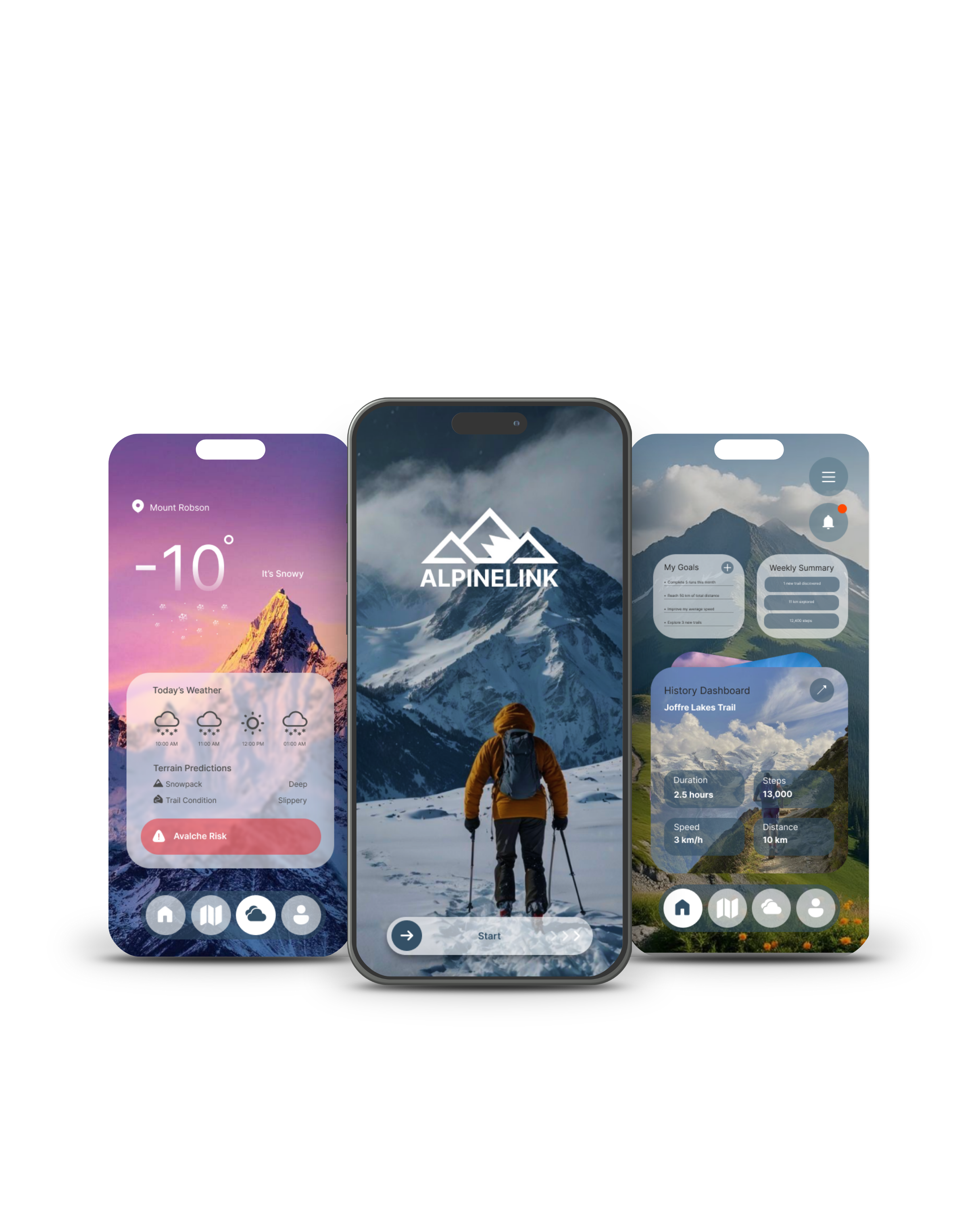
UI/UX Design
ALPINELINK
An app concept for hikers and outdoor enthusiasts, focused on accessibility, usability, and a more practical, visually appealing experience.
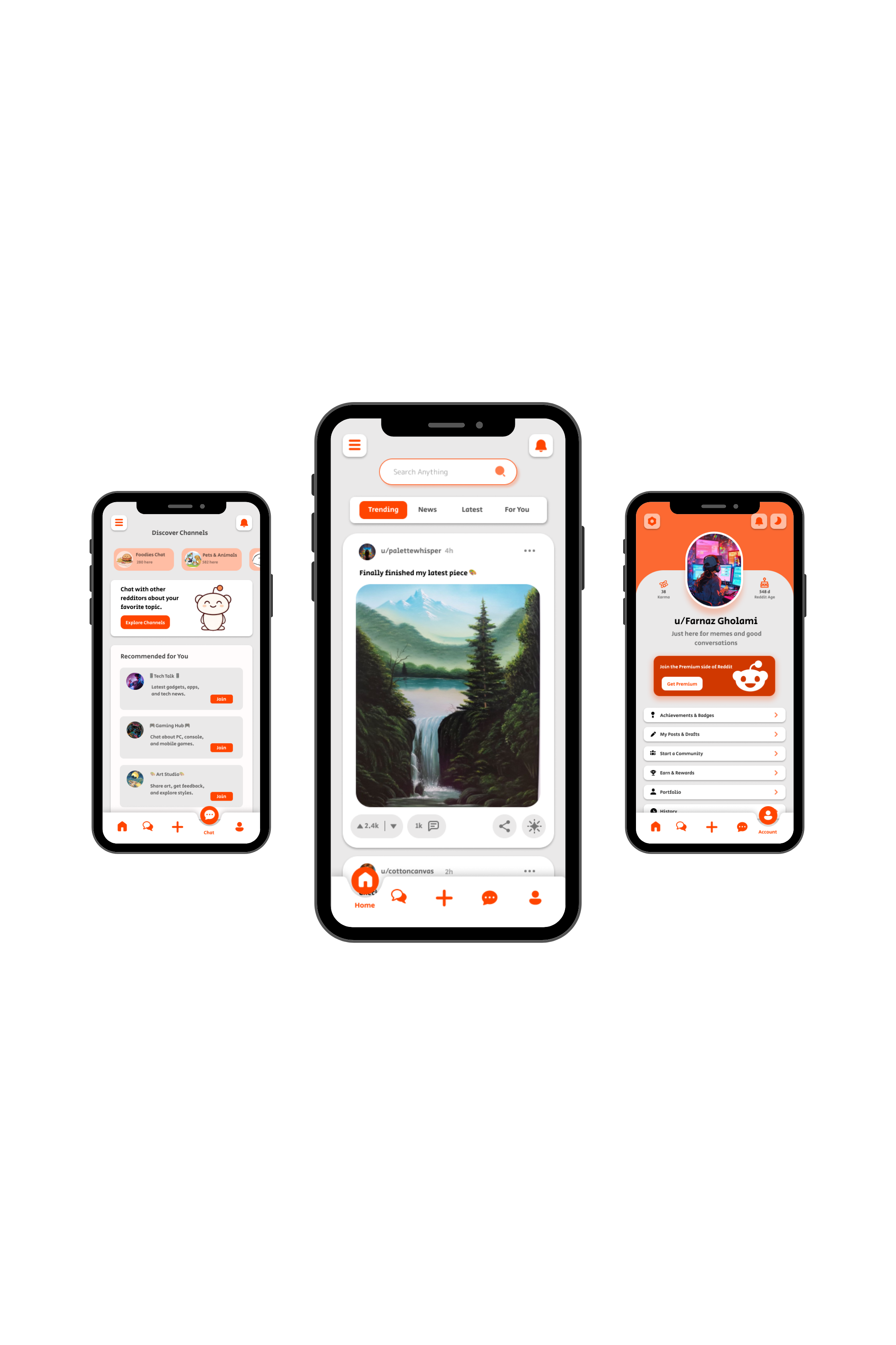
UI/UX Design
Reddit Redesign
BCIT UI/UX project focused on redesigning Reddit with a cleaner, more modern, and user-friendly experience.

UI/UX Design
SugarCloud Cupcake
Individual UI/UX project focused on creating a fully interactive Figma prototype using advanced prototyping techniques.
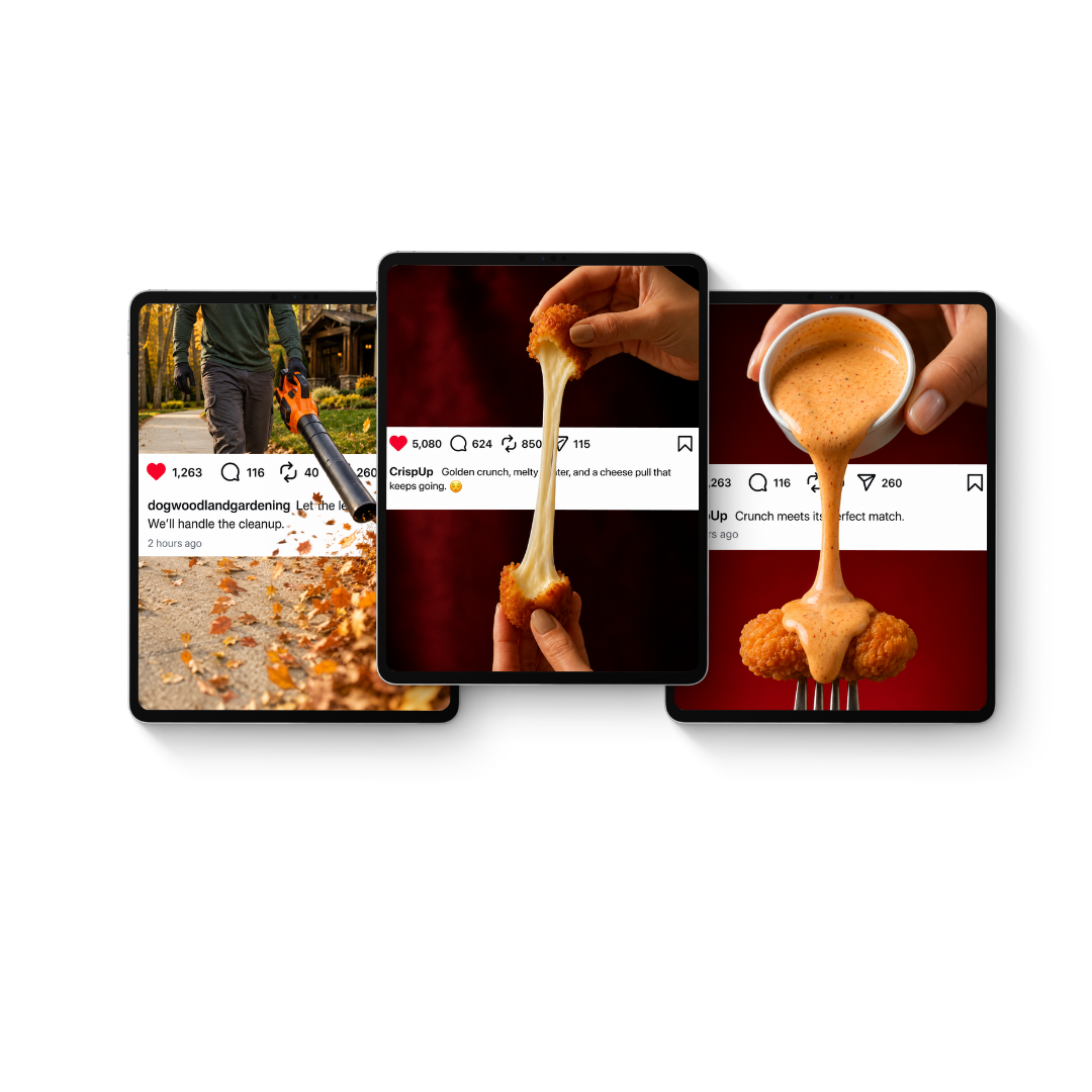
Social Media & Motion Design
Breaking the Feed
An exploration of AI-assisted motion marketing — where one intentional movement, connected to the brand's message, transforms a static post into a scroll-stopping experience.
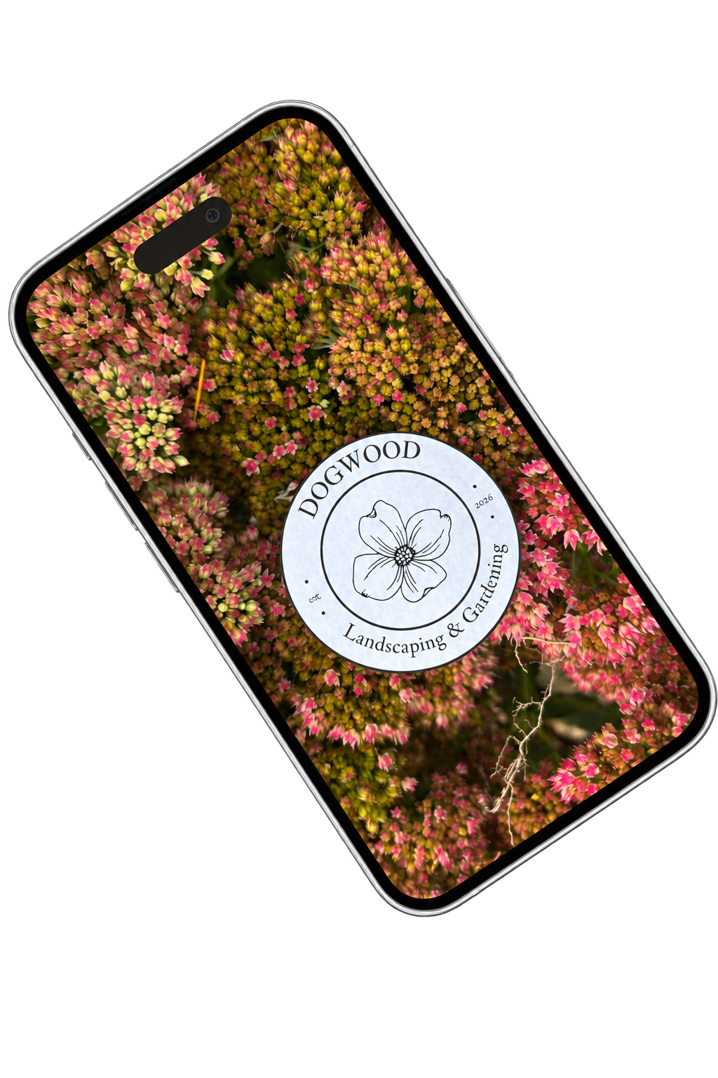
Brand Marketing & Social Media
One Logo, Many Places
A brand awareness reel for Dogwood Landscaping & Gardening — one logo, sixty environments, one recognizable identity.